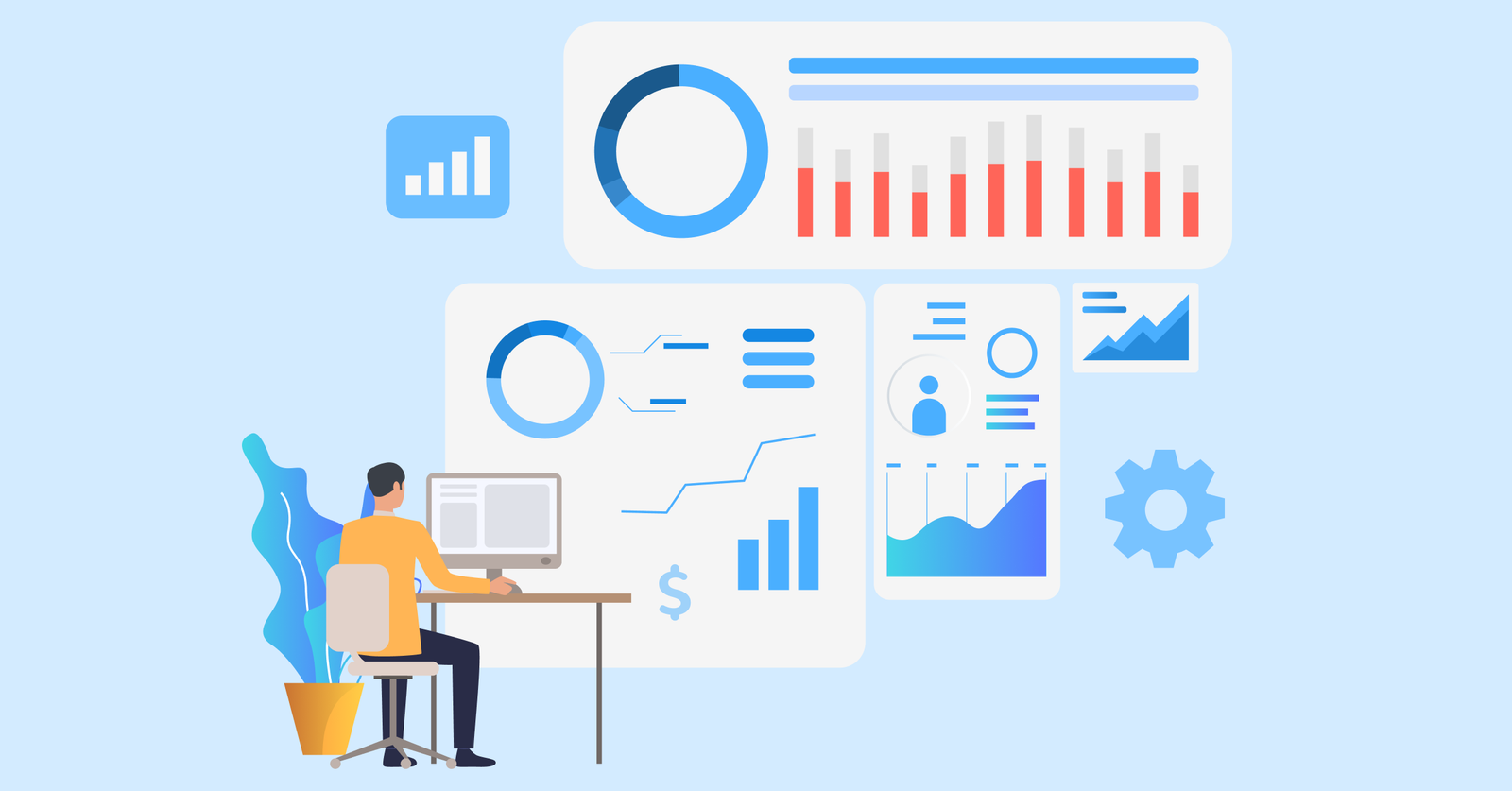
1. Sales Conversion Rate Dashboard
The dashboard shows how well your team moves prospects from one stage of the funnel to the next. It helps teams spot bottlenecks, understand where deals stall and decide which parts of the process need attention.
Key metrics:
- Lead-to-opportunity rate: The percentage of leads that qualify and enter your pipeline.
- Opportunity-to-proposal rate: The number of qualified opportunities that progress to a formal proposal
- Proposal-to-close rate: The share of proposals that convert into closed deals.
- Stage duration: Average days prospects spend in each funnel stage before moving forward.
- Exit point analysis: Where and why prospects drop out of your pipeline completely?
Start by mapping your CRM stages to match your actual sales process. Then create calculated fields that divide conversions by total entries for each stage. Set up automated alerts when conversion rates drop below your baseline performance.
2. Sales Rep Dashboard
The dashboard gives each rep a simple view of their daily progress. It shows the numbers that matter most, so they don’t have to dig through multiple reports to understand how they’re tracking.
Key metrics:
- Quota attainment percentage
- Pipeline value by stage
- Today’s activities
- Deals closing this week
- Average deal size
The dashboard pulls real-time data from your CRM and activity logs to show reps exactly where they stand. It updates automatically as they log calls or move deals forward. The view prioritizes upcoming actions, so reps know which prospects need attention today.
3. Sales Manager Dashboard
The team oversight tool gives frontline managers a complete view of their squad’s performance and pipeline health. It helps them understand who needs support, which deals require attention and if the team is on track for the quarter.
Managers use the view to run their weekly one-on-ones with each rep and identify performance patterns. The dashboard reveals which team members are struggling with specific stages or falling behind on activities. It also shows pipeline coverage so managers can see if there are enough qualified deals to hit upcoming targets.
Pro tips:
- Use weekly snapshots to compare how the pipeline shifts over time and catch issues early.
- Create rep-specific views so each coaching session stays focused on one person’s data.
4. Deal Performance Dashboard
The dashboard helps your team understand how different types of deals behave throughout the sales cycle. B2B sales teams need the dashboard because understanding deal patterns helps them prioritize high-value opportunities and allocate resources to the most profitable segments.
Average Deal Size by Product or Service
The metric shows how much revenue each offering typically brings in. It helps you see which products deliver the strongest returns and if the reps are spending too much time on low-value deals. It’s a simple way to guide focus toward the most profitable areas.
Sales Cycle Length
Measuring the time from first contact to close shows your real sales speed. It helps your team understand how long deals usually take, set clear expectations with prospects and plan revenue timing more accurately. Long cycle times can flag issues with qualification or slow internal steps.
Deal Velocity Trends Over Monthly or Quarterly Periods
Watching how quickly deals move through your pipeline over time shows if your process is improving. Seasonal patterns emerge that help you plan staffing and set quotas appropriately. Declining velocity signals problems with qualification or sales execution that need immediate attention.
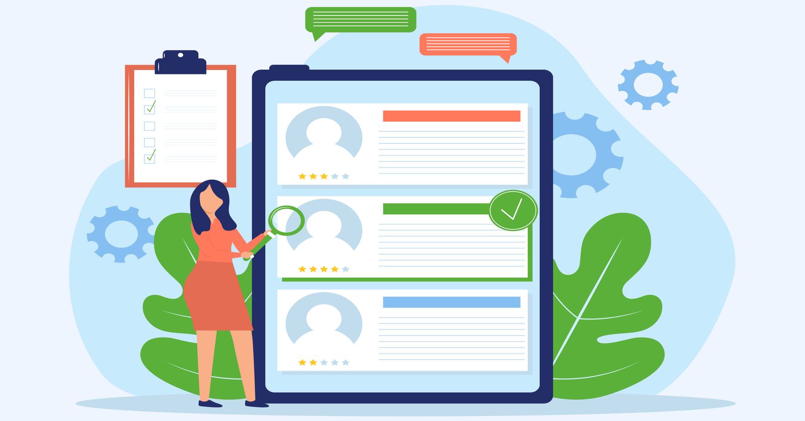
5. Win/Loss Dashboard
The dashboard shows why deals are won or fail across different sources and campaigns. Sales leaders need the view to refine their targeting strategy and stop wasting resources on low-performing channels.
Key questions:
- What information actually explains each win or loss?
- Are reps reliably logging win/loss reasons in the CRM?
- Which competitors show up most often in lost deals?
- How far back should we analyze to spot meaningful patterns?
Start by creating dropdown fields in your CRM for win and loss reasons. Train your team to select the reasons immediately after every closed deal. Then build visualizations that group these outcomes by lead source and time period.
Key metrics:
- Win rate by lead source
- The top three loss reasons
- Competitor comparison
- Average deal size for wins vs losses
6. Executive Sales Performance Dashboard
The dashboard gives leadership a quick, accurate read on overall sales health. It focuses on long-term trends and high-level performance indicators instead of day-to-day activity details.
Key ways:
- Use year-over-year comparisons: Show how current revenue stacks up against the same period last year. It makes growth patterns, seasonality and shifts in demand easy to spot.
- Include unit economics: Display customer acquisition cost next to lifetime value. It helps leaders see if their sales efforts are paying off sustainably.
- Segment performance views: Break down revenue by market segment or product line to identify which areas drive growth and which need strategic attention.
The dashboard includes high-level metrics like total revenue versus targets and customer acquisition trends. Consider adding market share indicators and new customer growth rates. Keep the view simple since executives need fast comprehension rather than granular operational details.
7. Sales Activities Dashboard
The activity-focused dashboard tracks the daily actions your team takes to generate pipeline and move deals forward. Sales reps use the view to ensure consistent prospecting effort and identify activity-to-outcome correlations.
Key factors:
- Quality over quantity: Track not just call volume but also connection rates and meaningful conversations held.
- Channel-specific insights: Separate phone, email and social activity. Each channel behaves differently and lumping them together hides what’s really working.
- Time-based patterns: Monitor activities by hour or day to spot when your team engages prospects most effectively.
- Conversion tracking: Link activities directly to opportunities created so you understand which actions actually generate pipeline.
The dashboard reveals which activities drive the best results by connecting daily actions to pipeline creation. Include metrics like outreach volume across different channels and response rates for each activity type. Track how many activities typically precede a sales opportunity so reps understand the effort required to generate a qualified pipeline.
8. Sales to Target Template
The dashboard shows how your team is tracking against revenue targets across weekly, monthly, and quarterly timeframes. It helps reps quickly see if the current pipeline is enough to stay on pace and what needs attention if it isn’t.
Sales leaders use this dashboard in weekly forecast meetings to discuss pipeline gaps and resource allocation decisions. Reps check it daily to see if their current pipeline supports hitting quota. The percentage calculations show not just where you are but what pace you need to maintain going forward.
Best practices:
- Review the dashboard every Monday morning to set the week’s priorities based on your gap to target.
- Create territory or rep-specific views so each person sees their own goals and progress.
- Set up automated alerts when performance drops below 80% of the target to trigger immediate corrective action.
9. Performance Overview Sales Dashboard
The comprehensive view combines multiple performance dimensions into one strategic snapshot of sales health. Leadership teams need the dashboard to understand which products drive revenue growth and where opportunities exist for expansion.
Key metrics:
- Revenue by product line: Shows which offerings bring in the most revenue and if your product mix is balanced or overly dependent on a few items.
- Geographic performance: Breaks down revenue by region or territory so you can spot strong markets, weak spots and areas worth expanding.
- Growth rate comparisons: Tracks current performance against previous periods to reveal if growth is speeding up or slowing down.
- Market share indicators: Measures your position relative to competitors in key segments and shows where you’re gaining ground.
Connect your CRM data to a visualization tool that can group revenue by multiple dimensions simultaneously. Create filters that let you switch between product views and geographic views quickly. Add comparison periods so you can toggle between monthly and yearly perspectives depending on what question you’re answering.
Sales Dashboard Tips
Check out the tips that will help you build dashboards that actually drive better decisions and performance.