1. Tailor Dashboards According to Team Needs
Your retention dashboard should act as a tailored command center for each department. A one-size-fits-all approach often overwhelms users, making it less effective. You can provide targeted insights by creating role-specific views. Your sales team might need upsell data, while customer success teams need engagement scores and engineering teams need technical performance metrics.
Executives should see high-level KPIs, while team leads need operational data for daily decisions. Custom widget arrangements allow teams to prioritize metrics relevant to their workflow.
Pro tips:
- Hold monthly feedback sessions to refine dashboard views.
- Link related metrics across dashboards to tell a cohesive customer retention story.
2. Establish Clear Visual Data Hierarchies
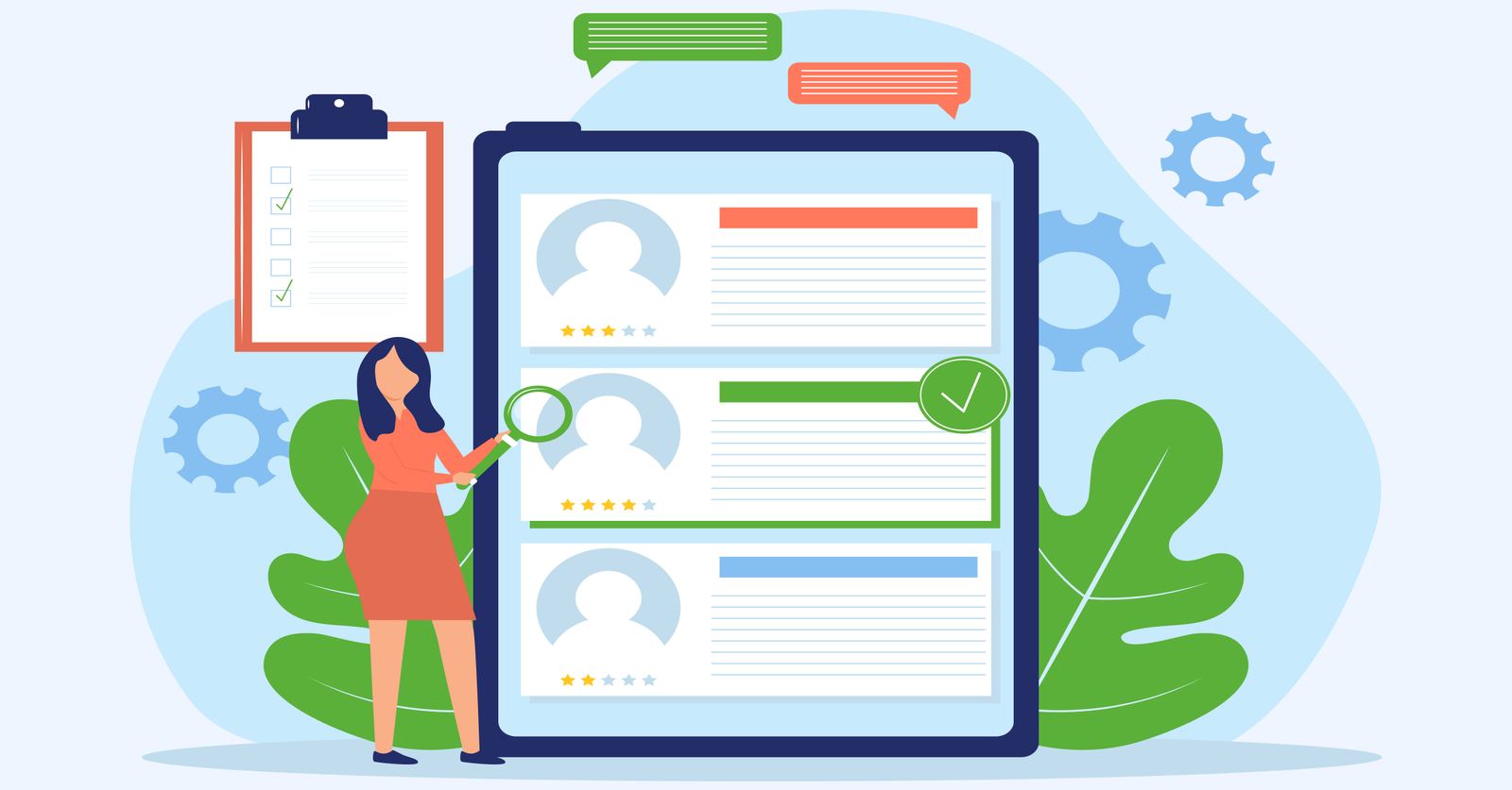
Visual hierarchy in your retention dashboard is key to making information instantly understandable. A well-organized layout reduces cognitive load, helping teams quickly spot trends or issues. Place critical metrics like churn rate and retention indicators at eye level to ensure that grab immediate attention.
Consistent color coding lets users easily identify categories and their relationships without needing to read every detail. Arrange metrics logically to guide users naturally through the data. Group related metrics together and use size along with positioning to highlight key insights.
Actionable tips:
- Use whitespace effectively to create clean breaks between metric groups.
- Design with the “five-second rule” – users should grasp key metrics in five seconds.
3. Enable Real-Time Data Refresh Capabilities
Real-time data refresh ensures your teams always have the latest customer insights, preventing missed retention opportunities or delayed responses. It’s like having a live pulse on your customer relationships.
Setting up API connections enables smooth data flow between customer touchpoints and your dashboard. Modern APIs handle data transformations and ensure consistent formatting, with backup systems providing extra reliability.
Best practices:
- Use health monitors to alert you when data refresh delays occur.
- Train teams to interpret refresh timestamps for context-driven decisions.
4. Set up Notifications for Retention Risks
Risk notifications serve as an early warning system for potential churn, allowing teams to stay proactive in managing customer relationships. Many warning signs may be overlooked without clear alerts until it’s too late.
Multi-channel alerts ensure important notifications reach the right team member, through Slack, email or mobile. Customizable preferences prevent alert fatigue by focusing on role-specific indicators.
Key takeaways:
- Create a risk score matrix to prioritize churn indicators based on historical data.
- Rotate notification channels to keep teams engaged and responsive.
5. Maintain Consistent Data Update Schedule
When teams know exactly when data refreshes, they can plan workflows and decisions effectively, ensuring everyone works with synchronized information. Refresh intervals should be tailored to metric importance and data volume. Critical metrics, like active user counts may require hourly updates, while long-term trends can use daily refreshes.
Documenting update cycles aligns the team’s workflows with data availability, ensuring retention analysis meetings focus on fresh insights. The alignment maximizes the value of every team interaction and prevents decisions based on stale information.
Pro tips:
- Sync your update schedule with customer time zones and peak usage periods.
- Recognize team members who spot and report data inconsistencies to encourage data quality.
6. Design Mobile-Responsive Dashboard Layouts
Mobile responsiveness is crucial for modern retention management, allowing teams to access critical insights anytime, anywhere. A well-designed mobile dashboard enables quick decision-making even when away from the desk.
Optimizing charts for smaller screens requires simplifying complex visuals without losing key messages. Prioritize actionable metrics that allow for immediate responses to retention risks, with a layout that minimizes scrolling or zooming. Touch-friendly elements ensure smooth navigation, with properly spaced buttons to prevent accidental clicks. The interface should be intuitive and maintain full functionality, even on smaller screens.
Actionable tips:
- Test your mobile dashboard during commute hours to understand real-world usage.
- Track frequently accessed metrics on mobile to guide layout improvements.
7. Segment Customers for Targeted Retention Analysis
Customer segmentation turns raw retention data into valuable insights by grouping customers based on key traits. The targeted approach helps you identify patterns that influence retention and churn, allowing for tailored strategies. Usage patterns highlight how different customers interact with your product, from power users to those who stick to basic features.
Understanding the patterns uncovers what drives value for each group. Lifecycle stages further deepen the insight, showing how customer needs evolve—early-stage users need more guidance, while mature customers seek advanced features. High-value customers with declining engagement need immediate attention while growing accounts can be nurtured for expansion.
Actionable tips:
- Map seasonal business trends to customer segments to predict retention challenges.
- Analyze customer segment changes to uncover triggers for product adoption or disengagement.
8. Allow Deeper Exploration of Retention Metrics
Deep metric exploration transforms your dashboard into an investigative tool, helping teams uncover insights about customer behavior and retention drivers. Teams can identify root causes of trends moving from observation to understanding by digging beyond surface-level data.
Click-through features allow teams to explore patterns, turning each metric into a gateway for deeper analysis. Historical comparisons provide context, helping teams identify if changes are part of normal variation or signs of concern. Custom report generation empowers teams to test hypotheses, combine metrics and share findings.
Best practices:
- Hold monthly “metric mystery solving” sessions to dive into unexpected retention patterns.
- Build a library of past investigations to guide future explorations.
Net Retention Dashboard Examples
Below are some interesting examples of how leading brands have implemented customer retention dashboards to transform their business relationships.
Amazon’s retention dashboard consolidates data from various touchpoints, such as purchase history, browsing patterns and customer service interactions. Key metrics like repeat purchase frequency, Prime membership retention and cross-category shopping behavior drive their personalized recommendations, strengthening customer loyalty within the Amazon ecosystem.
The data-driven approach has transformed Amazon’s business model. Insights from their dashboard have fueled successful programs like Subscribe & Save and Amazon Prime. The initiatives have turned occasional shoppers into loyal, long-term customers who depend on Amazon for their everyday needs.
Dropbox’s retention dashboard highlights key engagement metrics such as storage usage, collaboration patterns and feature adoption. They gain insights into what drives long-term user commitment by tracking file sharing, folder structures and premium feature usage.
The insights have transformed Dropbox’s product development and customer success strategies. Their data-driven approach has informed decisions on feature prioritization, pricing tiers and expansion opportunities, helping them evolve from a simple storage solution to a comprehensive collaboration platform.
Nike’s retention dashboard integrates data from their digital platforms, retail stores and fitness apps, offering a complete view of customer engagement. They gain insights into how customers interact with the Nike ecosystem across multiple channels by tracking workout frequency, product usage and community involvement.
The approach has been key in transforming Nike from a retailer to a lifestyle brand. Data-driven insights have fueled initiatives like Nike Training Club and membership rewards, strengthening emotional connections with customers and boosting brand loyalty.
Spotify’s retention dashboard zeroes in on user engagement, tracking metrics like listening patterns, playlist creation and social sharing. It also monitors premium subscription retention, including offline downloads and family plan usage.
The insights power features like Discover Weekly and Spotify Wrapped, offering personalized experiences that keep users engaged. The data-driven approach has transformed Spotify from a music streaming service into a daily entertainment companion, deeply integrated into users’ lives.
Retain, Engage, Grow with a Detailed Customer Retention Dashboard
A customer retention dashboard is your organization’s strategic compass, offering real-time insights into customer behavior, engagement and churn risks. It empowers teams to make data-driven decisions and shift from reactive to proactive retention strategies.
The true value lies in aligning teams around a shared goal keeping customers satisfied and increasing lifetime value. The dashboard becomes more than just a reporting tool by evolving into a central nervous system for your organization’s customer retention efforts enabling sustainable growth through improved customer relationships.
Key takeaways:
- A well-crafted dashboard turns data into actionable insights, enabling proactive retention strategies.
- Customizing views for different teams while maintaining a single source of truth is essential for success.
- Regularly evolving the dashboard ensures it continues to support your retention goals as business needs change.